Empathy

Assume
Listen

Curiosity

"How and why?"
"What if?"

Focus

Identify, define,
& solve

I believe...

    Great design comes from a place at the intersection of empathy, curiosity and focus.

    When we understand needs, we can build things that make the world better.

    We make meaningful discoveries only when we ask big questions.

    Any problem, correctly identified and defined, can be solved with the right effort.

Expertise

User Experience Design (UX)

User Experience Design is a data-driven creative process focused on optimizing the ways in which people and software interact.

I work with product managers, user experience researchers, subject matter experts, end users and engineers to create design documentation and prototypes for new products, as well as to maintain and optimize usability in existing products.

While there are standards and agreed-upon best practices, there is no singular perfect process for UX design. I strive to understand a client and their product vision inside and out so that I am able to use the right tools at the right time in the job, efficiently and effectively identifing, defining and solving design problems.
Web Development

My forte and first love is frontend development (HTML/CSS). I love the beauty and simplicity of designing in code, and the challenge of working across screen sizes and device types.

I have also developed a deep knowledge of WordPress, the open source software behind roughly one third of all websites. I understand its power as a full-fledged content management system for a variety of websites and web applications, and have dug deeply into the code, creating and launching several custom WordPress-powered websites.

Prototyping

Prototypes are demos of products used to validate an idea. They can range from paper sketches to fully-interactive, highly-polished on-screen experiences.

The tools available for designers to create prototypes are getting more robust, but the process can still be time consuming. I use industry standards like Sketch and InVision when appropriate, but more often than not, I find prototyping in HTML/CSS/Javascript to be the most efficient way to iterate quickly. HTML prototypes evolve seamlessly from clickable wireframes to high fidelity. They provide a framework for developers to build from, and they can be rapidly duplicated and reconfigured for A/B testing.

When working on web projects, we can often blur the line between design and development phases, as the prototype becomes the product.

Responsive Design Systems

The best web experiences let users achieve their goals in a unified manner on whatever device they choose. Modern html and css allow for immersive, app-like experiences via any modern browser, while degrading gracefully without losing functionality on older devices.

I think in terms of designing systems of configurable, accessible, contextually-neutral interface elements.

Portfolio of Selected Works

These projects have been curated to showcase breadth of expertise.

Please read the project description for context, then keep scrolling to see some of my key deliverables and contributions.

Communicating Process Status

How can customers better understand their progress through complex processes?

Transfering accounts from one brokerage to another involves many steps occuring over a span of several days. Depending on the transaction, there are combinations of online, mail/fax, and in-person actions to be completed.

The legacy system had evolved over time, and the end-to-end experience was often disjointed or incomplete. Due to siloing and specialization on the business side, the client experience varied wildly, even between seemingly similar transactions. The statuses of these transactions were difficult for customers to understand, and yielded a disproportionate volume of support calls.

Fortune 500 Financial Services Company

FutureDraft

  • User Experience
  • User Interface

Collaborative Design

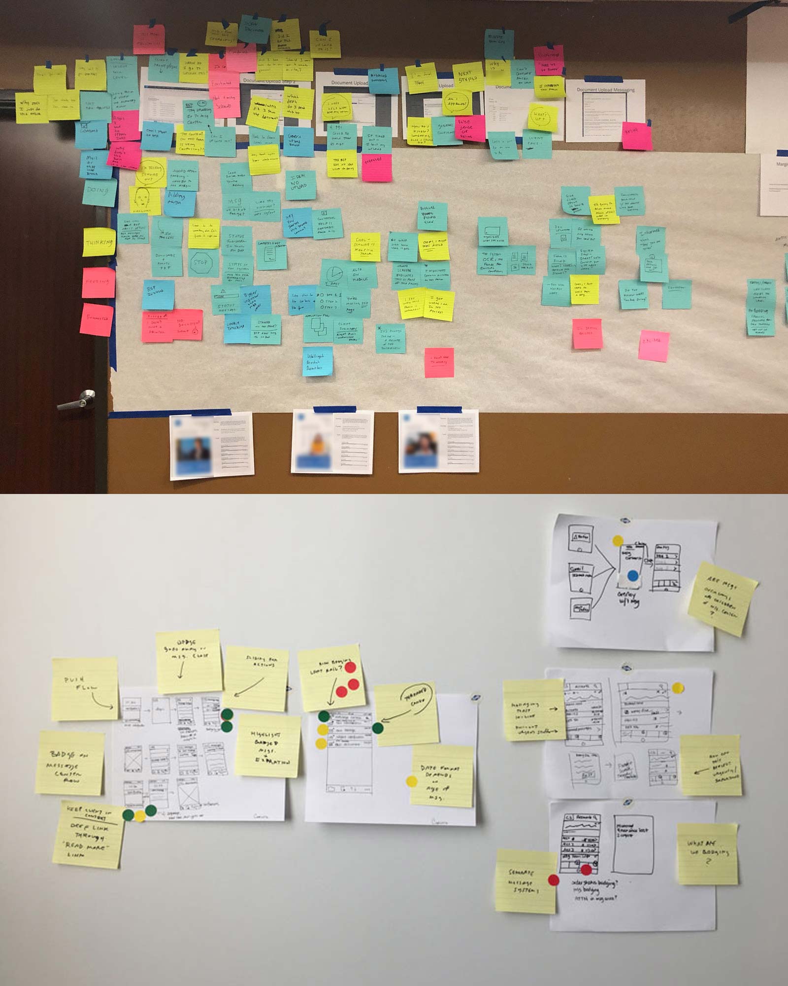
In partnership with FutureDraft, I facilitated several workshops with client stakeholders to understand existing workflows, painpoints and opportunities.

Design workshops vary in format, but generally involve three collaborative phases:

  • Discovery
  • Ideation
  • Validation

System Map

The proposed solution streamlines all status-related communications by:

  • Augmenting and aligning messaging communications
  • Creating interfaces to monitor status outside of messaging channels

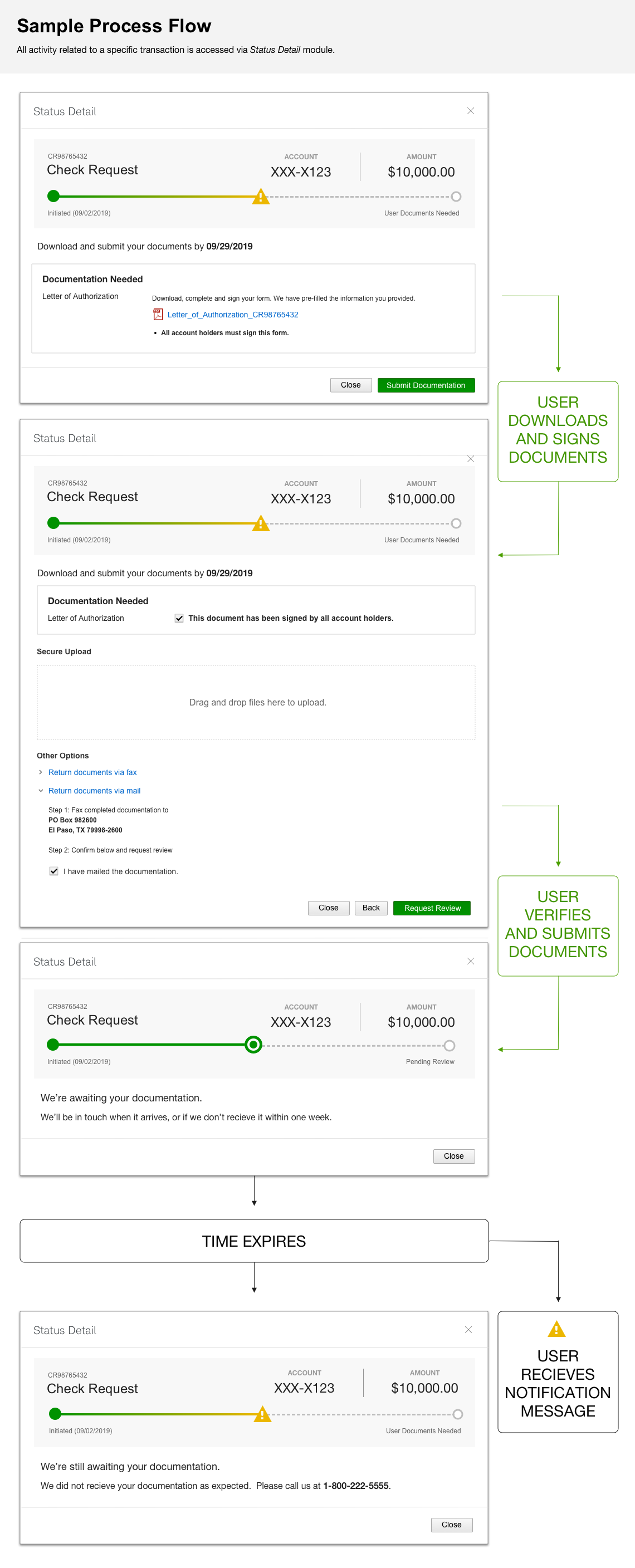
Status Detail Activity Flow

All required actions are completed through the Status Detail panel.

Transaction activity is consolidated and centralized, reducing confusion.

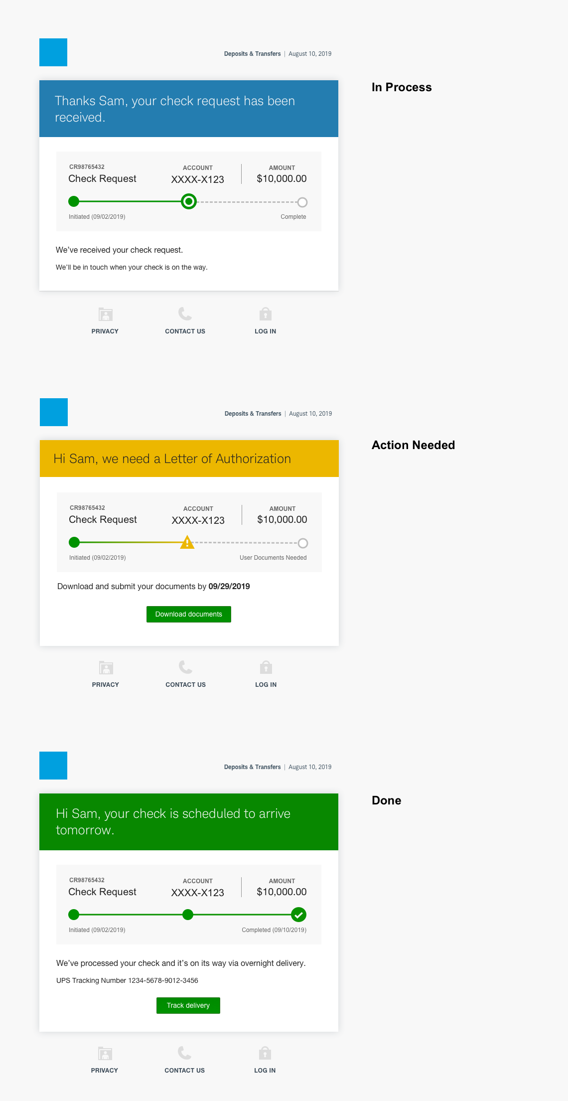
Messaging States

Redesigned emails are simpler and more concise with clear CTA and direct visual ties to Status Detail.

Managing Dynamic Workflows

How does an enterprise manage and prioritize rapidly changing task lists?

This project was a redesign and consolidation of several disparate software offerings that helped manage a seasonal workflow involving record retrieval from healthcare providers, distilling patient records and ensuring compliance against several benchmarks.

Healthcare Technology Company

FutureDraft

  • User Experience
  • User Interface

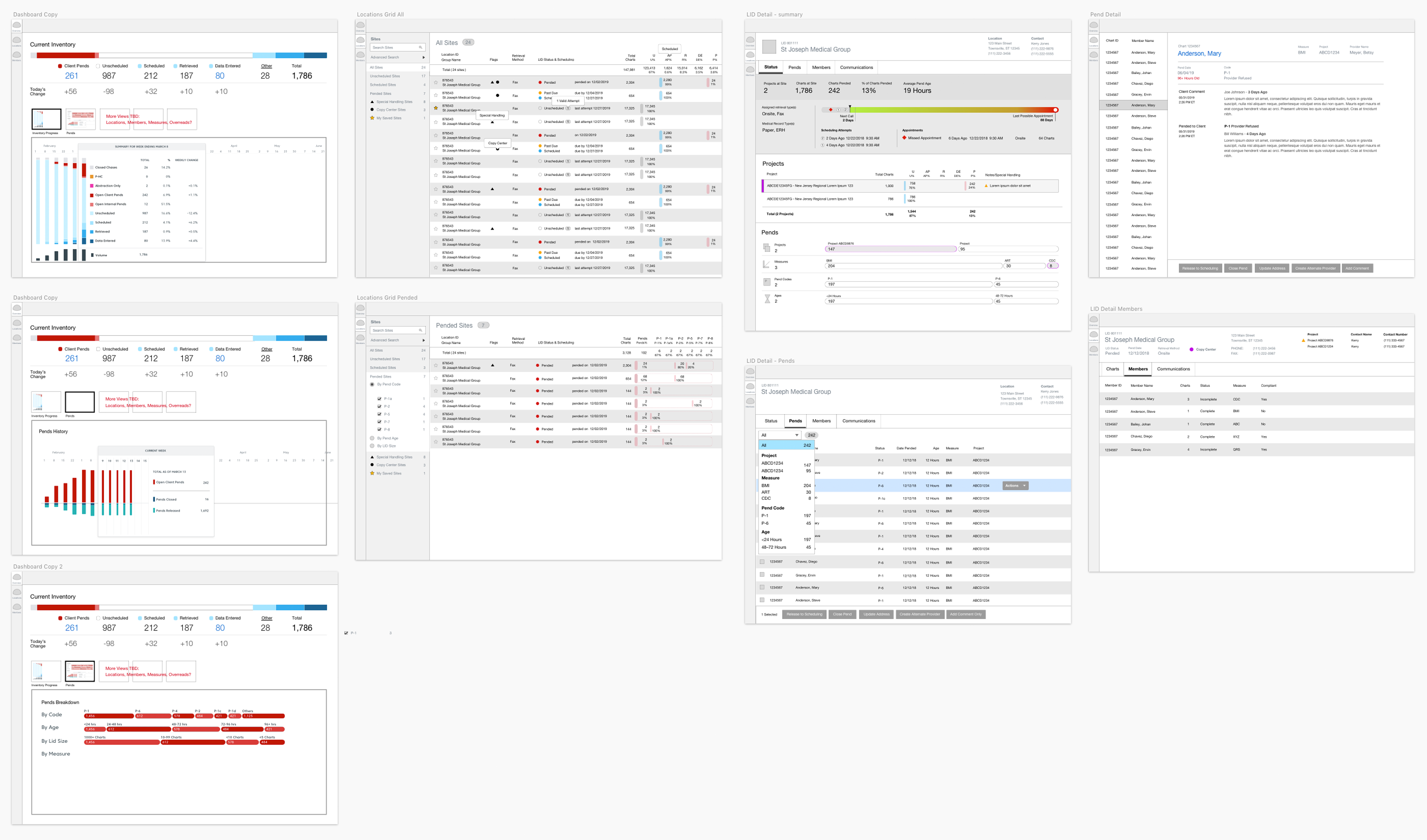
Wireframes

I was brought on to this project after much of the discovery phase had been completed.

After a few deep dives to get an understanding of the business and the design problem, I created these wireframes to validate the design direction before moving on to high-fidelity prototyping.

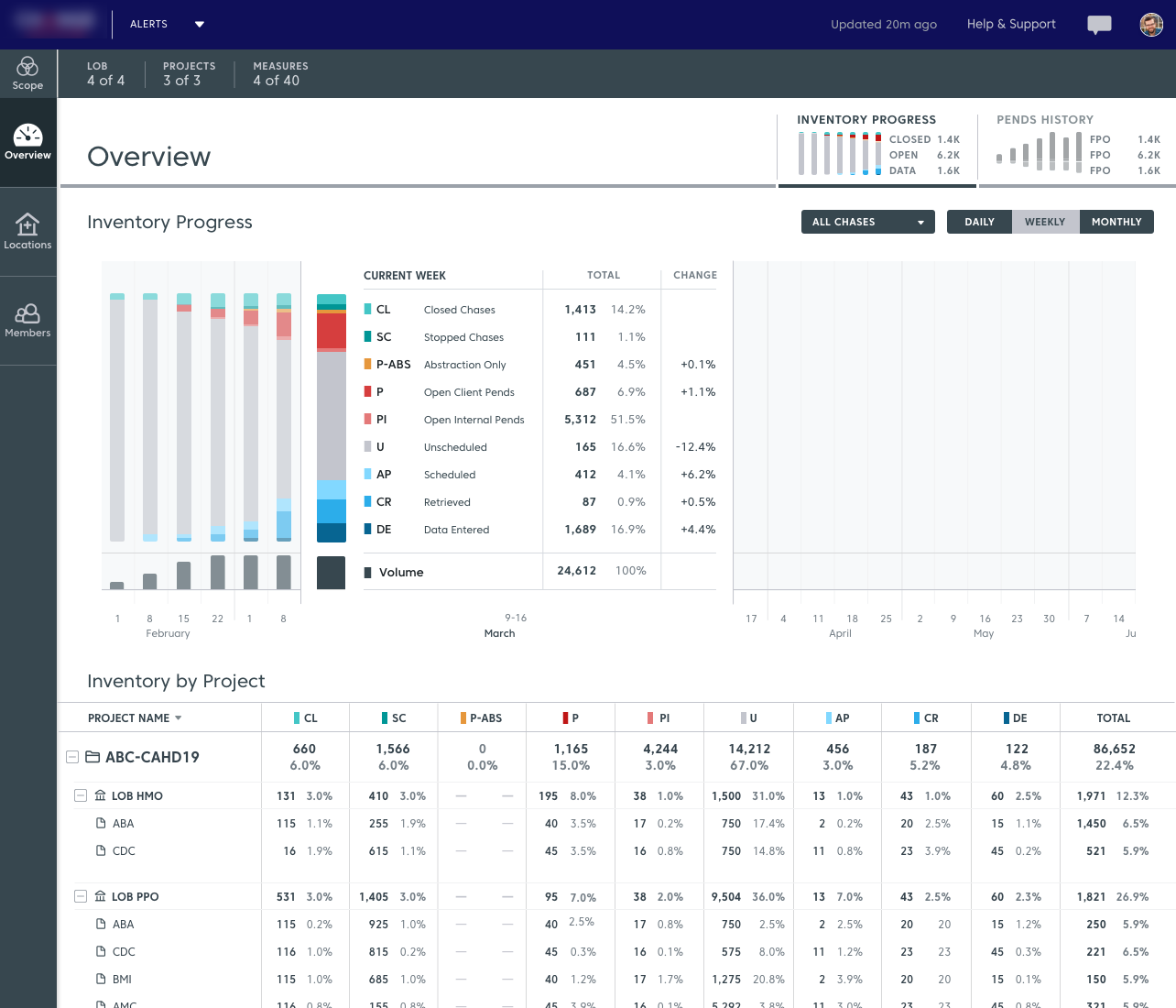
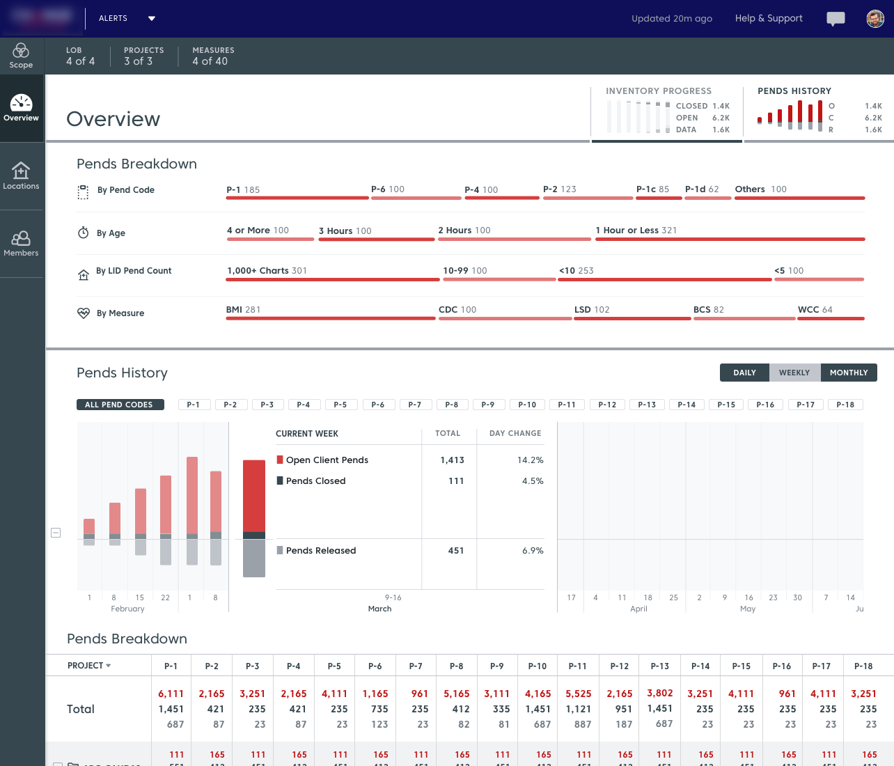
Dashboard: Inventory Progress

This is a manager's view of overall progress on a document retrieval and data-entry project.

This company has a well-established pattern library. UI and visuals were designed in alignment with existing patterns.

Dashboard: Pends History

Pends are problematic charts. Medical records that for one reason or another require extra attention and resources.

This dashboard is designed to provide an overview of pended record requests.

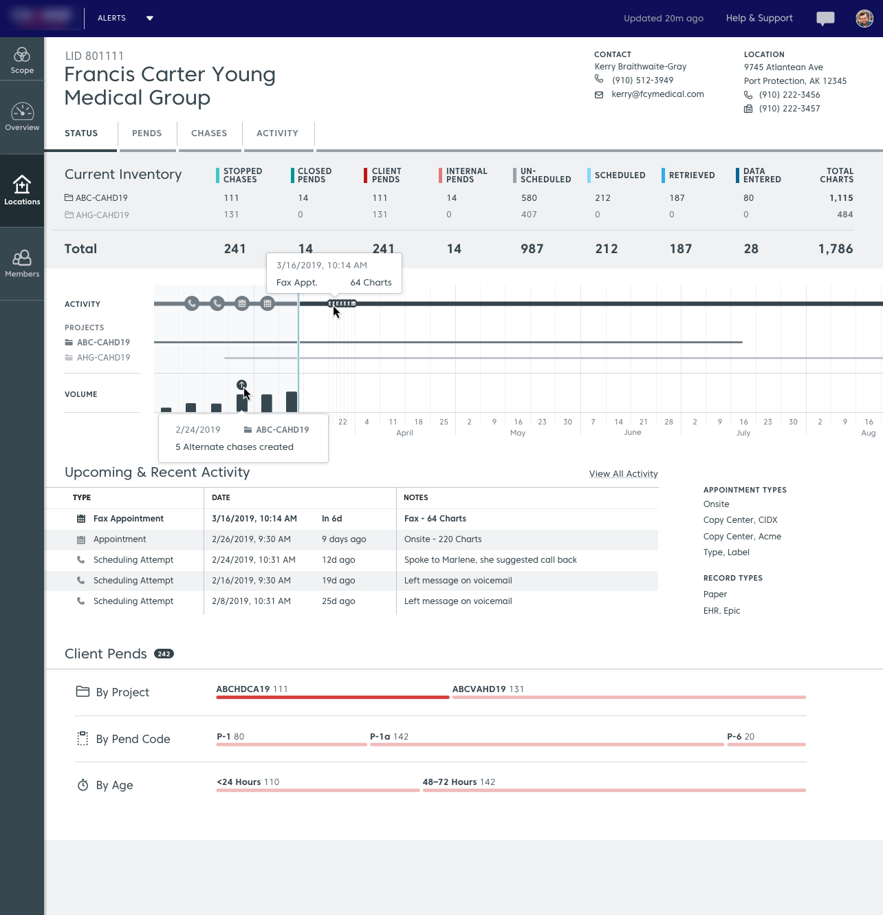
Location Detail

Locations represent care provider facilities. It's critical that data-retrieval personnel are able to work efficiently with locations, while keeping requests to a minimum and avoiding redundant calls.

This page shows overviews of charts that have been requested from this facility as well as a history of contact and past and future scheduled data retrieval appointments.

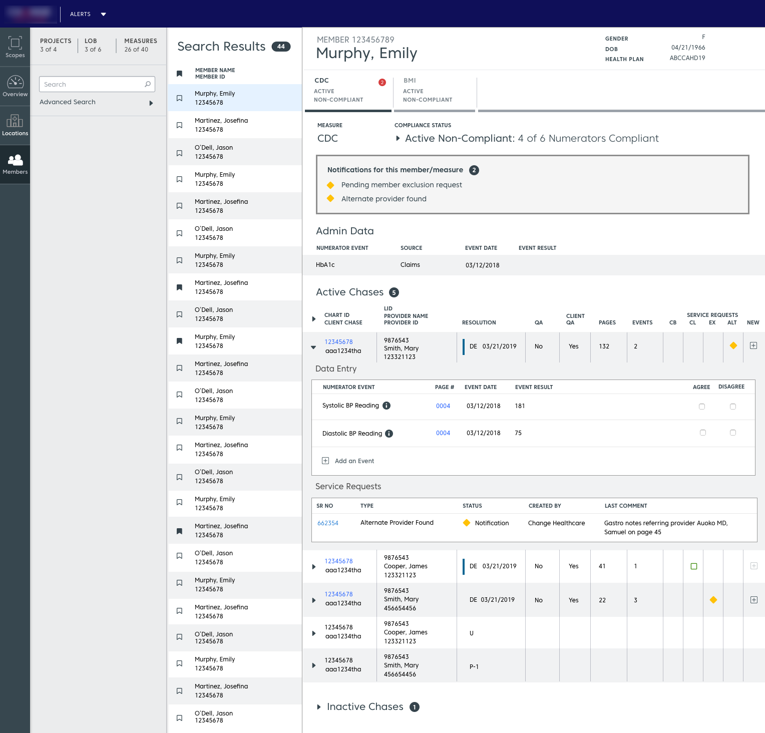
Member Detail

Members represent individual patients who are enrolled in a particular health insurance plan.

Compliance with health plan standards is measured at the member level, and often involves records from across multiple providers.

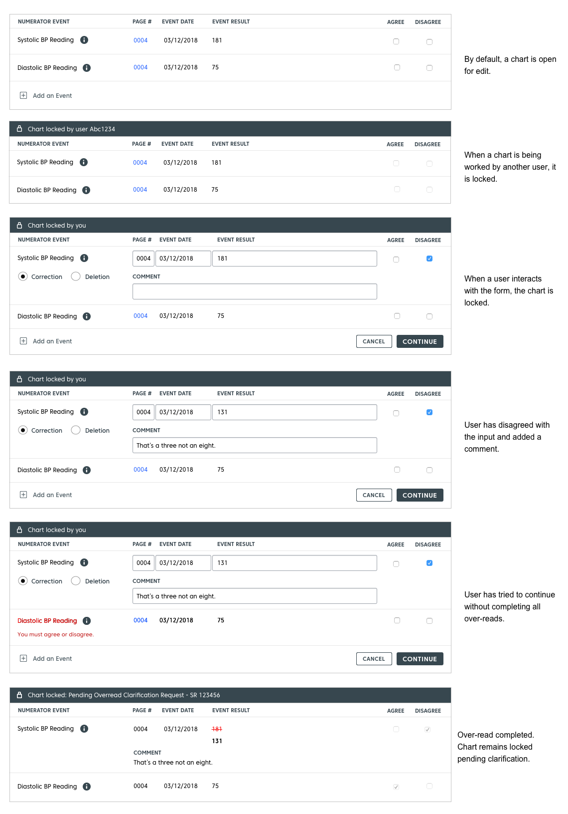
Data Entry Microinteractions

Over-reading is a QA process involving confirming the data that has been manually input from medical records.

Protecting At-Risk Animals

How can a federation better support member organizations?

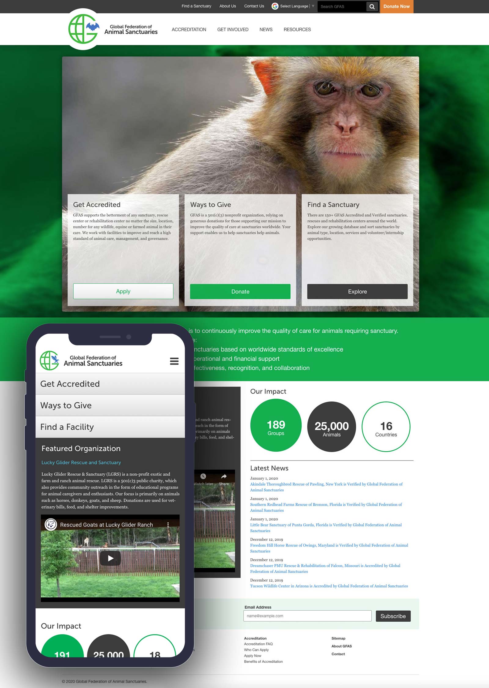
I designed and developed a new website for the Global Federation of Animal Sanctuaries (GFAS) as a pro bono project.

The project included a complete redesign of an existing WordPress site and the addition of a major new piece of functionality for a "sanctuary clearinghouse" where site visitors can find and donate directly to animal sanctuaries.

The new site is fully responsive across devices and designed in alignment with a new branding system created by a third party.

Global Federation of Animal Sanctuaries

  • Product Design
  • Visual Design
  • User Experience
  • Development
    • Wordpress
    • Front End

Home Page

The website is fully responsive, displaying beautifully on all screen sizes.

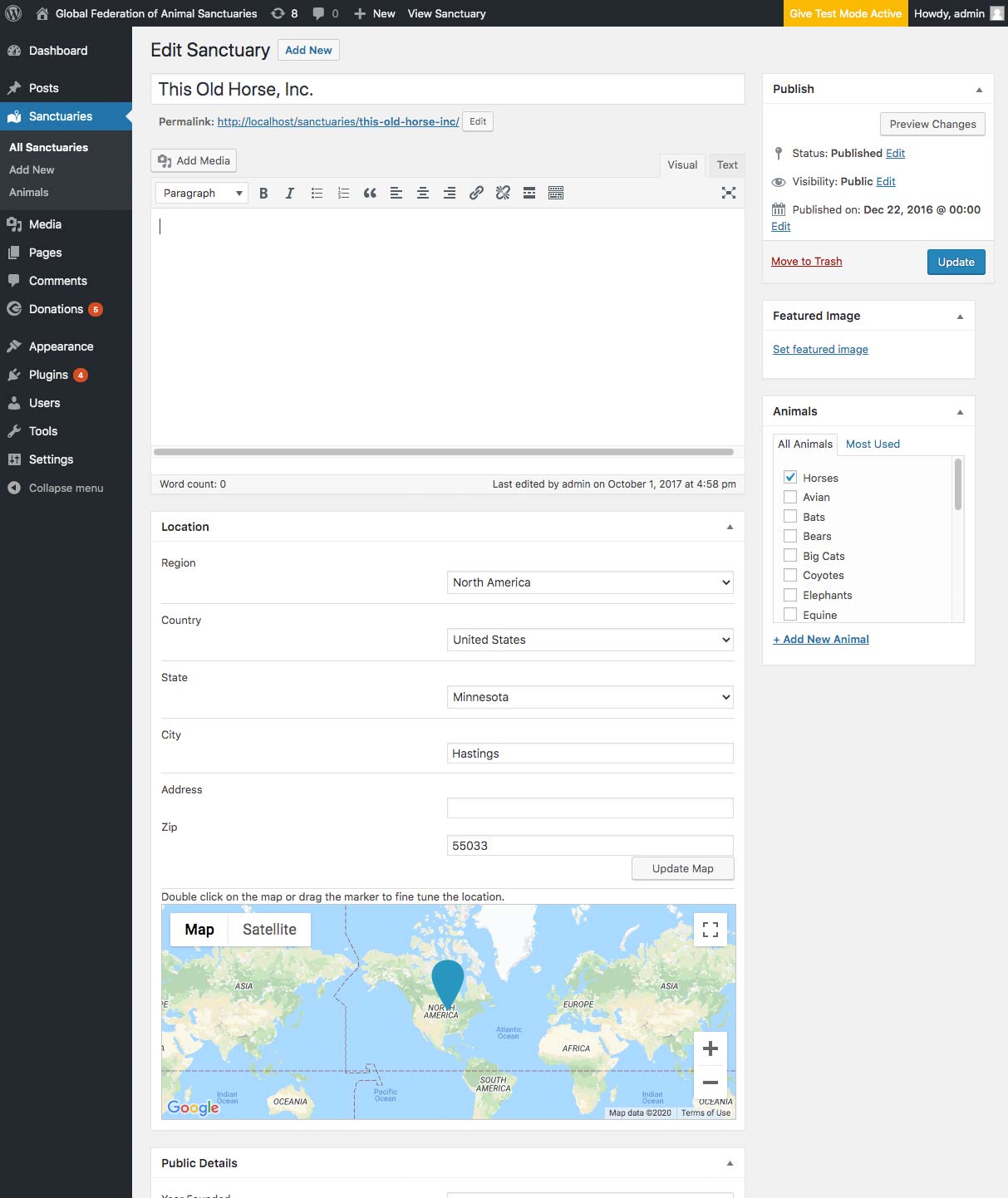
Sanctuary Admin Area

Sanctuaries are a custom post type within WordPress with animals as a custom taxonomy.

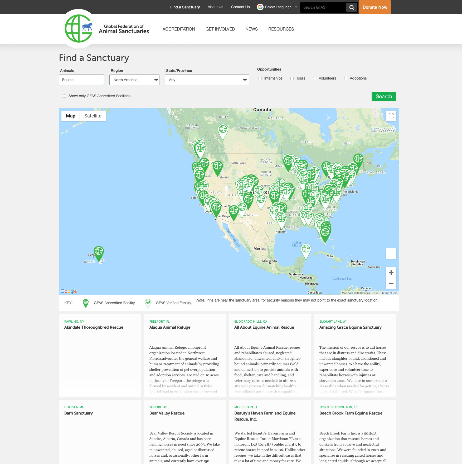
Sanctuary Search

Visitors can search and filter by animal types, locations, opportunities and accreditation status.

Donation Jar

The donation jar is built in javascript and runs completely on the front end, saving specified sanctuaries and donation amounts to a cookie before passing it into the give-powered payment gateway.

Visualizing a Financial Goal

How can an investor understand progress toward a long-term goal?

I built this prototype using the highcharts charting library as a proposal for a new method of visualizing a savings goal.

Traditionally, account growth projections are shown as a parabolic range moving forward from the current balance. An estimation can be made of how likely the end balance will be to meeting the goal, but the relationship between the current balance and the goal likelihood is not always clear.

This model flips the approach. It uses a present value calculation to look backward from the goal toward a range of starting balances that would reach the end goal under a range of future performance options.

The narrowing of the funnel is a visual representation of the need to reduce volatility in a portfolio as the time to target decreases.

Fortune 500 Financial Institution

  • Product Design
  • Data Visualization
  • Prototype Development
    • Front End